Tuesday, 8 March 2016

16mm Film Direct Animation

Yesterday we took a trip to The Cube, a cinema in Bristol, for a workshop day. In it, we developed our Super 8 film-in-a-day films, as well some direct animation.

We started off by watching three animations: Begone Dull Care (Norman Mclaren), Free Radicals (Len Lye) and Virtuoso Virtuell (Maja Oschmann & Thomas Stellmach). The first two were animations that worked directly onto film, with music added to. The latter was digitally animated to look like ink blots. 


I think both methods would be equally hard. With the film versions, the initial animating may have been easier but coordinating it with the music in the planning process must've been very difficult and time consuming. The digital one may be harder to animate, but I think it would be easier to keep track of where the music is lining up with the animation.

Later, we experimented by animating 16mm films ourselves; scratching into, drawing on, painting on etc. I think what made it so difficult was how big our tools (brushes scratchers) were in relation to the film. It made every mark I made feel clumsy, so I wasn't too happy with the outcome of mine. This was later then all added together and we watched it at the end. Although we weren't up to Mclaren or Lye's standards, it was still pretty cool to watch.

I can definitely still see these techniques around today. A lot of music videos have elements of them in, some adverts, even in a couple of films. The first video reminded me a lot of the scene in 'Dumbo' with the pink elephants. 

New York!!


Reviewing what I've taken, it doesn't look like I took many pictures. I think this was because a lot og the time we were in a big group and always on the move. If I saw something that caught my eye and wanted a picture of it, I'd have to hope my camera was on and ready with all the perfect settings for that shot because we didn't have time to stop in fear of losing the rest of the group. Unfortunately, most of the time it wasn't. 


12771807_10204394867312291_8355787740920224692_o.jpg


This photo was taken in Grand Central Station. I was sat on the floor, waiting for our group to meet back up, and people watching.


I found I did a lot of people watching in New York; there were so many faces I’d never see again and I found it interesting watching them go about their daily lives. For some, I’d try and put a story to their faces. With others I’d simply watch what they were doing; eating, waiting, rushing, etc.


In my opinion, the warmth of the photo itself gives the illusion of a much more friendly appearance than it is. If the picture had less warm tones it would give off a much different vibe. In reality, cities and busy places like Grand Central are generally quite unfriendly places.


I quite like this photo because you can’t see anyone’s face even remotely clearly. I think this gives a contrast between the hustle and bustle of the city and the anonymity of everyone as they just rush about their lives not really taking notice of much other than themselves. For me, this picture highlights that there are so many people with so much going on in their lives, but in a way that cuts out their identity and makes me wonder if any of us really matter in the grand scheme of things; we’re just another person to watch.

12792375_10204394833711451_6059054750586442464_o.jpg

I love this photo. I took it on the first day (I think). It was a totally last second snap; I hadn’t checked the settings or focus or any of that so obviously I wasn’t expecting much. I just wanted to catch a picture of a yellow school bus - I’m pretty cliché, I know. When I saw the photo after I was pleasantly surprised. I love the position of the bus, the contrast of the yellow on more dull colours, and it’s in focus! I think New York is the place for taking cliché pictures just because everything has been in a movie of music video and it’s all so iconic and recognisable.


I think actually being there was so odd because everything felt like a video but it was all so normal to everyone else. The fact it’s such an iconic thing on its own kind of takes away from the fact there’s actually a story behind it; kids going to school, they have their own lives and stories.

I think the great thing about the snapshots of busy streets is that there’s a kind of still serenity that is totally different to the actual feeling of the place at that time. This was taken at around 7am and it already felt like a busy midday in Weston.

Experiment: Polaroids

Polaroids

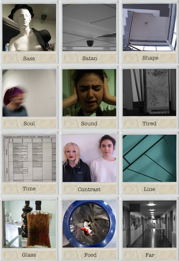
So we did a mini project on polaroids. We started off by formatting a camera; simple enough, just go to settings and it’s usually one of the first things that come up. Then, we were set the task of capturing 12 images that correspond to 12 words. The catch? We were only allowed one shot at capturing the 12 images.

The words were:
  • Contrast
  • Far
  • Food
  • Glass
  • Line
  • Sass
  • Satan
  • Shapes
  • Soul
  • Sound
  • Time
  • Tired

Now what really threw me off here was my lack of camera experience. I’m getting the hang of camera settings, but it usually takes me a couple of test shots before I get things just right (which is why if I’m in a rush I just use my iPhone camera- it’s good on auto). I’m also not very Photoshop savvy, so when my tutor said “don’t worry, you can edit them later”, it wasn’t exactly reassuring.

Strangely, just like my New York bus photo, I found that the one I liked best was a very spontaneous meant-to-be-mugshot of a friend as she was passing in the corridor.

I didn’t really edit my photos too much. A couple of them I converted to black and white, but mostly I just tweaked the brightness. As for putting my photos into the template, we were talked through the whole process so I didn’t find it too difficult. I find it easy to understand layers and order of layers in photoshop so it was mostly just logic to cropping them and ordering them so they were behind the polaroid template.

I think overall it would’ve been useful to have a go at using polaroids because they really are one time photos, though there’s no scope for editing and I wouldn’t have learned things in photoshop without the template.

Screen Shot 2016-03-08 at 11.44.29.png

That was my contribution to the project. I think you can definitely tell they’re digital imaged placed on a template which kind of makes it look a little silly just on its own. On the wall with the whole class’ efforts put together, I think it is much more effective and doesn’t look so oddly fake. It’s nice to compare how everyone visually represents things.

Tuesday, 9 February 2016

DOCUMENTARY DEADLINE!

Here is the end product of my documentary project!


The images don't look amazing on this blog as I had too screen shot because I couldn't upload the original file as I created it in InDesign. 

At first, I wasn't sure whether I wanted to do film or photography, but either way my plan was essentially the same. I'd document makeup artists at work and ask them a few questions. I decided to go with photography and although I do love the way it turned out, it is very different to how I originally planned. The feel I was going for was quite a plain, straight forward representation of my photographs and my interviews. I think it was the research that ultimately changed the outcome of my project.

I started my research by looking at more traditional photo documentaries, where the emphasis is on the photograph with the text coming after. The text in these wasn't necessarily any less important than the photos, but visually it wasn't the main focus. It was when I started looking for layout ideas that my project really started to change. I used magazines like i-D, Aesthetica and Vogue. My biggest influence was i-D. What I really liked about the layouts in i-D was how the text was important to give the photos context, but showed in a way that wasn't a text based article but more of a caption. This really inspired me to go from a generic photo documentary layout to a more sleek and stylish magazine- type layout. 

I felt quite at ease taking the photos. I used to do the makeup course so I emailed my old tutor and asked if she'd mind me taking some photos and interviewing her students - obviously she was delighted. Makeup studios generally have a lot of light anyway, so there wasn't too much of a problem there. The sound recording was fine because I was only using it to transcribe so it didn't have to be perfect but it was a good way to practise and learn more about sound recording. 

Editing has been such a nightmare, just because I've never really used any editing software. I started off using photoshop to edit the images individually- adjusting the lighting slightly and making them black and white. This was mostly trial and error; I'd look through all the options and try one, seeing what some of them did and how well I liked the effects. For the most part I only adjusted the curves and made them black and white. After this, I started putting the pages together on photoshop but after a chat with my tutor, I found out it would be a lot easier to do on InDesign. It was a bit of a pain restarting it all and overall I didn't find it too much easier than photoshop anyway. It was easy enough, though, after being shown how to use it. 

Overall, I'm pleased with the outcome of this project. Looking at it now, I've realised on the first page that the word 'Focus' is too high and touches the image and that the lower photo on the 4th page looks a little odd as it's smaller than the rest from where I'd cropped it. These problems, however could be very easily fixed so I'm not too worried. Some of the text is a little hard to read where it goes over a white patch. I did try to put a layer behind the text but I really didn't like the look of it. If I were to be really picky and do this again, I'd find a way to maybe darken the background (the image) in certain areas so the image isn't obscured too much. I also think that, after seeing it printed out, I could get away with making the text a little bit smaller so even less of the photos are covered. I think was I really need to focus on is attention to detail, but I guess that after hours trying to learn a new software and re-edit my whole project my mind just went to mush!

Thursday, 4 February 2016

Choosing Fonts: Styles and Colours

So, I was walking to college, planning out on what I had to do today when I realised I haven't even thought about what font I'm going to use.

I looked through all of them and shortlisted 4 of them.

Bank Gothic 

Bell MT Regular

Didot Italic

Modern no 20 Regular

I added the blocks of white to the photo as a background for the text as I think it's easier to read as there's a mix of light and dark all over this photo. 

Looking at these, I like Modern no 20 Regular the most, just because it's not too fussy but not boring. It has the right balance of practical and classy, just like a makeup artist!

I got thinking, what would the same layout look like with white text on a background?

I think I like the white text on black more but in my opinion. I think the white just washes it all out whereas the black frames it and really draws out the darker points.

I'll look at different fonts for the smaller text I use to write up the interviews.


Tuesday, 2 February 2016

Final(ish) Photos

I've managed to narrow down my photos to 50. I'd still like to narrow them down to 36. I'd ideally like 36 because I interviewed 18 artists, which I'd like represented 2 to a page with 4 photos per page; totalling 36.

I'm going to brush up my photoshop skills and try to narrow the selection down further after I've tried to edit them.

I'm coming round to the idea of them being black and white but I'm not 100% decided yet.


EDIT: I've since changed my layout plans and would like some photographs on a single page on their own, so I'll have to narrow down my choices even more. I think I'll scrap some of the workspace pictures because I just don't think they have the contrasting impact that I originally wanted.

(More) Layout Options

So today, I spent some time in the library looking through magazines like i-D, Aesthetica and Vogue. 

I mainly looked at interview/editorial style pages. These are a few that resembled what I was going for. These are from i-D.


What I like about them all is that the main focus is on the photos, not the text like in other magazine interviews I've seen. As I don't have a lot of text from my interviews, I think these types of layout would be much better than the ones I originally came up with.

I like the ones with multiple pictures because then I can fit more of my work into the project as I only have a limited number of interviews. The only problem with this is that they would have to all be the same size and a few of my pictures need cropping so getting them to look good the same size might be tricky. Of the 2 pages with 4 photos on each, I prefer the one with the border between the photos. In my opinion it looks a lot neater.

I think the text in boxes looks a lot better than the first page, where the text is overlaying the image. I just think with the picture they chose, with lots of varying colours, it can make it more difficult to read the text. This layout would've worked better if there had been an area of darkness on the photo with light writing or visa versa.

The smaller snippets of quotations in a bigger font (3rd and 5th picture) are very good at drawing you in and giving an insight to the tone of the interview.

I think I'll try and have a mix of single photograph pages and ones with multiple on. I'd like to have the single photos with the smaller snippets of text, with the full interviews paired with multiple images.