Monday, 30 November 2015

Photomedia: Photographer Research

Instagram was a very useful place for me to find photographers. I already follow a lot of makeup artists so through them I can find various photographers.

Tina Einsen- www.t-two-photo.com/


The black background really emphasises the colour in the makeup. The lighting aids the contour of the face and adds to what the makeup already started. 

Jayesh Pankhania- http://www.jayeshpankhania.com/
The lighter background works well on more natural makeup where highlight and strobing is more of the emphasis than contour. I also like having one eye as the focal point with the other either hidden by hair, shadow, or just cut out of the shot.

Margaret Kimura- www.margaretkimura.com/
What I like about these photos is that even though the eyes are mostly the focal point, there are other things going on in the pictures. I'm extremely drawn to the photo on the bottom right, where the hair is covering her face. I would me more inclined to make the eye stand out just a little bit more though, maybe with makeup or just using a model with a more striking eye.

Paul Ward- http://www.paulward.net/

Ward's style is very dark and not usually what I'd like, but I think it captures eyes in a really different way than the others. Maybe this is something to do with the masculine models.


Tuesday, 24 November 2015

Photomedia: Makeup Ideas

This is a brilliant piece of art by Lara Hawker. The use of the human features painted as an animal mixed with her original features is really strikings and it's something I'd love to bring into my work.

I couldn't find the original artist for this, but I love how striking and creepy this is. I think a full face photo of this where the painted eye resembles the natural eye would look amazing.

Blue Eyes:
This was on a BuzzMakeup post. I like the simplicity of this makeup and also the photo itself. The way it's taken really focuses on the eye because it's the only part of the face that is fully shown. I think to create more emphasis on the eyes I would use a darker brow and more of a neutral lip colour.

Brown Eyes:
This Desi Perkins makeup look is one of the most beautiful I've seen for brown eyes. The lashes, warm colours and strong brows makes the eyes appear so bright and gives quite a liquidity to them. 

Green Eyes:

Again, ridiculous college internet restrictions means I can't find the original artist for this makeup. For the green eyes, I'd love to do a bit more of a wacky, avant garde makeup. This one is particularly effective because the skin, though it would have makeup on, looks very bare and natural. This completely contrasts with the bright, extravagant makeup around the eyes. I also like that there is no hair in the picture, no lip colour and the neck is bare too.

Final option: Photomedia - Initial thoughts

Brief: TEXT

For this project, we chose a word from random in a dictionary. Mine was 'EAGLE EYE'. I am pretty happy with this and I think I'm going to focus on the 'eye' part as I know I really want to focus on makeup/body paint for this. I come from a makeup background, studying Production Arts for two years prior to this course. I haven't enjoyed my previous two options so I'm really hoping I can get stuck into this and really love it.


This is my initial thinking for the project. I think I'm going to do a mix between body painting different animal eyes and doing makeup on different colour human eyes. 


Sunday, 27 September 2015

End of Project one: Ups and Downs

So I have finally finished the first project on my UAL course (almost). My hand in date is tomorrow and I have to write an evaluation to finish it all off. I think it would be appropriate to talk about my whole experience of these few weeks, not just my work.

I've really been feeling like I've been thrown in the deep end so far and it's been a pretty uncomfortable experience. I had a few days off in the first week due to illness and that put me a bit behind with my work.  I came in every day and stayed for all the self study periods to catch up and I managed complete almost all of the criteria for this project, though I do feel like I'm still lacking a bit compared to others. 

Most of the people I've talked to have been doing art for two or three years. I, on the other hand, have hurtled in from a theatrical makeup background and didn't even take GCSE art. Just to add to this feeling of inadequacy, I wasn't really making any friends up until the last week. There was a point where I was honestly thinking this course wasn't right for me and I wouldn't see it through; I was feeling so lonely and behind and eventually everything just piled up and I had a rather embarrassing tearful episode with my tutor. We did talk it out and I felt a hell of a lot better afterwards, knowing that I wasn't going to fail and as long as I had worked hard, it wasn't necessarily bad that I didn't have as much work as some other students.

With regards to my work, I am a little disappointed in the amount but proud of what I have achieved. Looking around, I saw a lot of people filling up all their walls with so much work; colour, black and white, sketches, fabrics, paints, all sorts! I, having very little experience with a lot of the mediums people were using, spent more time just playing around with them than making work I could put on my wall. Over the course of the project, I played around with shibori (a Japanese tie-dye), ink, oil pastels and even coffee! 

I have a prediction that I may not get amazing grades in this course like I did in my previous one, but I really think I'm going to take a lot more out of it knowledge wise. For me, that would be a good outcome.

Wednesday, 16 September 2015

Week 2: So Ill!

Well, I have fallen tremendously behind after being ill all week. The good new is after sleeping for pretty much the whole week, I am feeling better (though still tired as always) and ready to catch up.


Today, I focused mainly on experimenting with various mediums to get different effects and see what I enjoyed. Because I've studied theatrical makeup, a lot of art materials are very new to me. I tried ink, charcoal,oil pastels and poster paint. Out of all of them, I preferred the ink because it was just so much more versatile and you could create so many different effects using different tools. I ended up using the ink to create my A1 piece.


This is what my piece turned out like. I think the reason I'm not fully proud of this is because I used black ink; I used blue ink when I was practicing. The blue had a lot more depth and range of tones, whereas the black just washes to a grey and looks very flat. I do like how eerie the black makes the work look.

I didn't end up finishing the building because it ended up looking too neat in contrast to the messiness of the rest of it. After leaving, I had an idea to use  folded card to make the marks instead of a brush, so I'll finish it off tomorrow. I also don't think this is detailed enough for my final piece so I'm not really sure what to do.


This is the smaller, charcoal drawing I did of the same scene. I like that this is quite messy  but also detailed.


I'm still a little confused as to what medium to use for my final piece as I don't think I've got the detail in my current piece to be able to recreate smaller pieces. I guess I've just gotta get a move on and think of something, pronto!

Wednesday, 9 September 2015

A Day Out At Knightstone- 8/9/15

Following the launch of our first project, entitled 'Land and Water', we spent a day out on the sea front up at Knightstone. Throughout the day we drew different parts of the landscape.


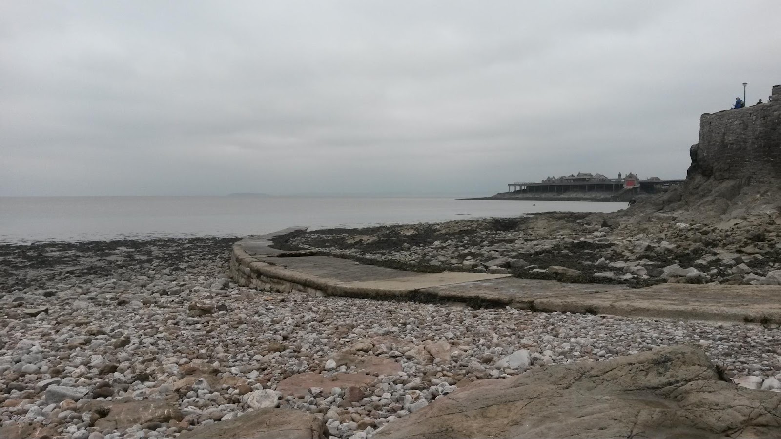
(Left)
A small pebble beach between Marine Lake and Birnbeck. One of the drawings I did on this was was of the pathway seen here, disappearing into the water.

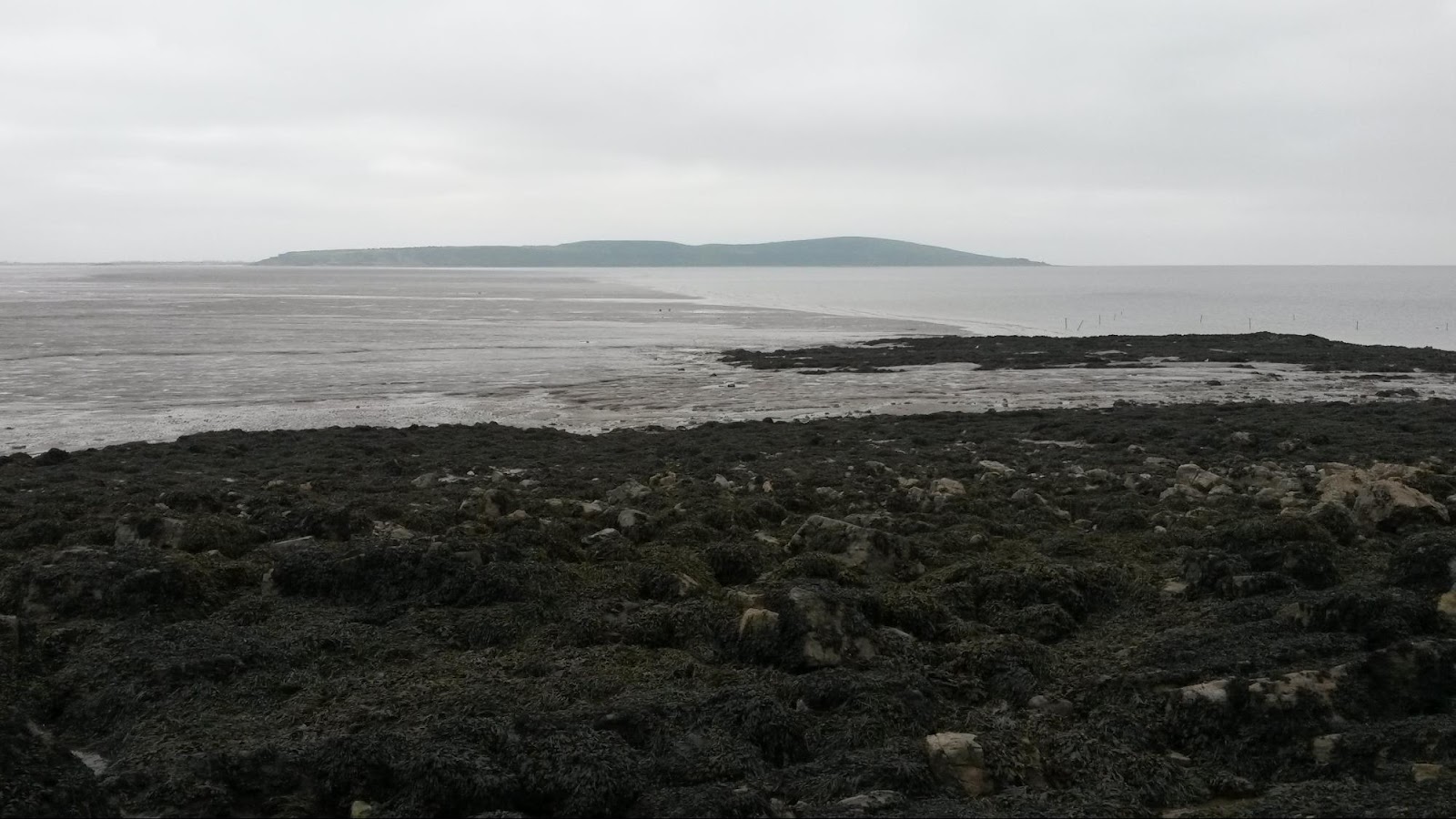
(Right)
A very gloomy looking Brean Down.


(Left)
A rock pool. I did want to draw a rock pool as I think they are a nice combination of land and water that isn't a full on landscape. I didn't have a chance because there was nowhere for me to sit and draw (everywhere was wet and uneven). I may try and draw this from the picture at a later date.


 I'm not a massive fan of drawing landscapes so even though I know I need to practise to improve, I like thinking of other land/water examples. I also find it a lot harder having to draw in black and white, which was what we were asked to do at first. I think once I can start adding colour in, my work will improve.


(Left)
Boats at the end of the beach.


(Right)
Path at the pebble beach, leading out into the water.


(Left)
Marine Lake Bridge.


I am not exactly proud of this work, but I believe it's important to document my work throughout this course to document my development.